February's been trucking along at full speed so far!
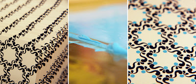
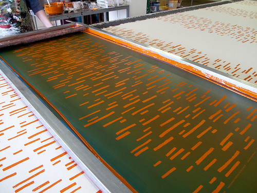
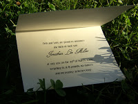
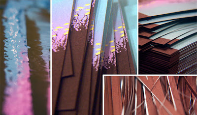
On Super Bowl weekend, I printed up a set of wedding invitations for a bride in Texas. They were a customization of my country sunset design, and involved a gradient that was making a little nervous, to be honest, but they came out great. I'll have full pictures in a few days on the Phaedra Paperie blog but til then, here's a little peek into the printing process.
Then, I got back to the work of remodeling/reorganizing my studio. I know it's been a long time since my Remodel: Part 1 post, but it's an ongoing process.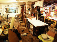 My studio has vertical beams that run down the middle of the space, and the remnant of the house's original chimney, which makes it hard to make the most of the space. Boxes and piles have a tendency to collect along the dead space around the beams. So I took that area and turned it into a work surface with storage underneath. It's not yet what I would call clean, but now at least I have a well-lit place to do small paintings, drawings, pen and ink, etc. without having to clear a spot and sit on the floor.
 Capping off the month so far, yesterday I had Kate from Katie Joy Photography over. She's an up-and-coming photographer who will be shooting her first wedding in only a couple of days, and just got a new camera. We know each other from our day jobs, but it was great to interact with her on a professional level. I needed some professional/head shot type photos, and I also wanted to get some action shots in the studio. We looked through a few, and they looked promising -- the studio shots especially looked great. I'm so excited to see all the shots!
On Super Bowl weekend, I printed up a set of wedding invitations for a bride in Texas. They were a customization of my country sunset design, and involved a gradient that was making a little nervous, to be honest, but they came out great. I'll have full pictures in a few days on the Phaedra Paperie blog but til then, here's a little peek into the printing process.
Then, I got back to the work of remodeling/reorganizing my studio. I know it's been a long time since my Remodel: Part 1 post, but it's an ongoing process.
My studio has vertical beams that run down the middle of the space, and the remnant of the house's original chimney, which makes it hard to make the most of the space. Boxes and piles have a tendency to collect along the dead space around the beams. So I took that area and turned it into a work surface with storage underneath. It's not yet what I would call clean, but now at least I have a well-lit place to do small paintings, drawings, pen and ink, etc. without having to clear a spot and sit on the floor.Capping off the month so far, yesterday I had Kate from Katie Joy Photography over. She's an up-and-coming photographer who will be shooting her first wedding in only a couple of days, and just got a new camera. We know each other from our day jobs, but it was great to interact with her on a professional level. I needed some professional/head shot type photos, and I also wanted to get some action shots in the studio. We looked through a few, and they looked promising -- the studio shots especially looked great. I'm so excited to see all the shots!