The studio has been in some state of remodel/redesign since I moved in. No surprise there. Recently I've been working on pulling up the carpet (lots of carpet glue; slow work) and painting the floor, and generally making the space feel lighter and more finished. Hemming and hawing over colors...
For a while, sections have been a pretty strong yellow. "Butternut Squash." The thought was that, since it's a basement space with very little natural light, it needed some pretty intense color therapy to not be a depressing cave. But it turns out, it's just too overwhelming. Oppressively yellow.
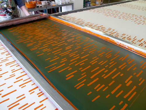
Once again I start collecting paint chips. I have a whole ziploc baggie somewhere with probably a full pound of little cut out samples, but I have to start fresh for each project. This time around, the focus was mainly on blue... with a few samples of persimmon, coral (a color that's been on my mind for a while now).
The floor is going an almondy, warm white. Something bright, but not stark, with a satin finish. With only about a sixth of the floor (if that much) painted so far, it's already brighter, feels more like a legitimate space. But in need of color.
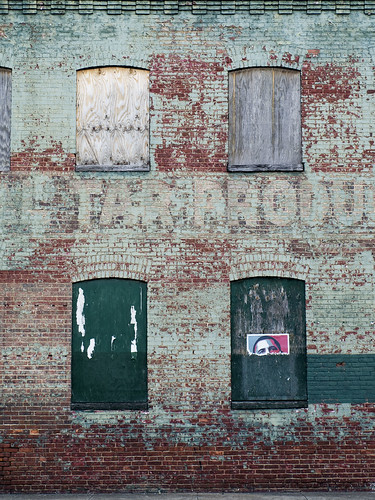
My attention has lingered frequently on the remnants of the old chimney that comes down through the middle of my space. My dad says remove it; it would open up the space so much more. And that's true, but there's something about it that I love. Between that and the dark, exposed beams, it becomes my own little (underground) New York warehouse art loft. (I've been looking for ways to restore it that don't involve caustic chemicals... have yet to find anything satisfactory.)
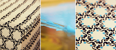
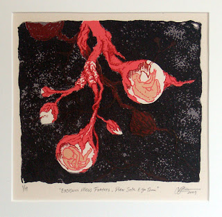
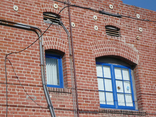
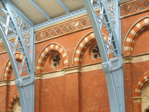
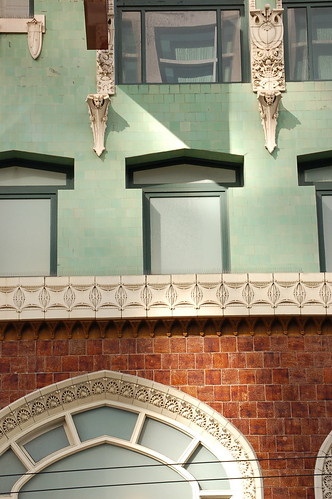
So, from there, I've come to a potential palette of antique brick and some sort of pale, warm or dusty blue. Not too primary, not too teal... something nuanced. Then, to Flickr for some inspiration in that vein:

For a while, sections have been a pretty strong yellow. "Butternut Squash." The thought was that, since it's a basement space with very little natural light, it needed some pretty intense color therapy to not be a depressing cave. But it turns out, it's just too overwhelming. Oppressively yellow.
Once again I start collecting paint chips. I have a whole ziploc baggie somewhere with probably a full pound of little cut out samples, but I have to start fresh for each project. This time around, the focus was mainly on blue... with a few samples of persimmon, coral (a color that's been on my mind for a while now).
The floor is going an almondy, warm white. Something bright, but not stark, with a satin finish. With only about a sixth of the floor (if that much) painted so far, it's already brighter, feels more like a legitimate space. But in need of color.
My attention has lingered frequently on the remnants of the old chimney that comes down through the middle of my space. My dad says remove it; it would open up the space so much more. And that's true, but there's something about it that I love. Between that and the dark, exposed beams, it becomes my own little (underground) New York warehouse art loft. (I've been looking for ways to restore it that don't involve caustic chemicals... have yet to find anything satisfactory.)
So, from there, I've come to a potential palette of antique brick and some sort of pale, warm or dusty blue. Not too primary, not too teal... something nuanced. Then, to Flickr for some inspiration in that vein: