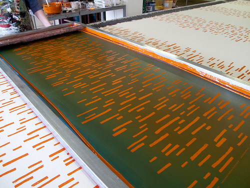
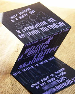
 I recently printed up a small run of birthday invitations for a friend's daughter -- my first custom design for a child. Expectedly, it's quite different doing a youth design compared to doing a wedding, but what surprised me more was how different it was to do a design for a specific kid, rather than just for "kids." Normally I think of kid-oriented design to be too saccharine, too bright, or overly Swedish-inspired for my taste (I get my fill of swedishness working for the big blue-and-yellow box) but this design came out a little edgy, I think. Or maybe a little 80s. I couldn't help but fall back into memories of Paula Abdul songs and that unforgettable skate rink smell (ancient chewing gum ground into little black spots on the carpet + icee machines + preteen hormones) at the mention of a roller skating party.
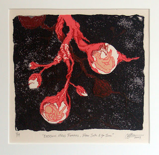
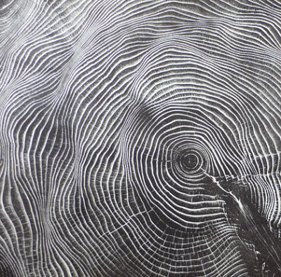
currently in Family show at Launch Pad Gallery,
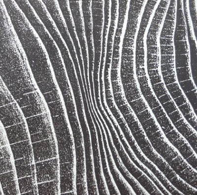
is also available on Etsy
And last but not least, I've had two pieces accepted into a recent graduate show at Portland State. More details to come...