Screenprinting for the DIY Bride - April 3rd

I'm teaching a small hands-on workshop on silk screening your own wedding invitations, and there's still time to sign up!

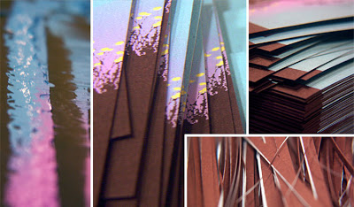
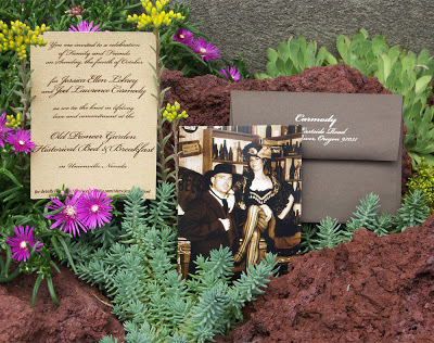
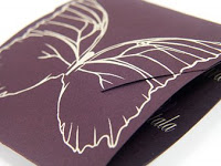
Wedding costs can really add up, and invitations are no exception. In this class, you will learn how to use silkscreen printing to make your own hand-printed wedding invitations. Get exactly the invitations you want – at a fraction of the cost!

In the first part of this class, we will discuss materials. What do you need? What can you do without? Which corners can you cut and still get a good final product? And where can you get it all (plus, how much of it do you already have)?

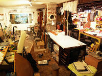
In the second part, each participant will get hands-on experience with the entire printing process. You will leave with a variety of cards and sample invitations, the experience and confidence to start on your own wedding invitations!

I'll be bringing everything we need to start printing. Just bring your crafty self!

Saturday, April 3rd
12-3pm
Cost: $45.00

Contact the Portland Paper Zone to sign up: (503) 233-2933
1136 South East Grand Avenue
Portland, OR 97214

Oh, February, how you fly!

February's been trucking along at full speed so far!

On Super Bowl weekend, I printed up a set of wedding invitations for a bride in Texas. They were a customization of my country sunset design, and involved a gradient that was making a little nervous, to be honest, but they came out great. I'll have full pictures in a few days on the Phaedra Paperie blog but til then, here's a little peek into the printing process.


Then, I got back to the work of remodeling/reorganizing my studio. I know it's been a long time since my Remodel: Part 1 post, but it's an ongoing process. My studio has vertical beams that run down the middle of the space, and the remnant of the house's original chimney, which makes it hard to make the most of the space. Boxes and piles have a tendency to collect along the dead space around the beams. So I took that area and turned it into a work surface with storage underneath. It's not yet what I would call clean, but now at least I have a well-lit place to do small paintings, drawings, pen and ink, etc. without having to clear a spot and sit on the floor.


Capping off the month so far, yesterday I had Kate from Katie Joy Photography over. She's an up-and-coming photographer who will be shooting her first wedding in only a couple of days, and just got a new camera. We know each other from our day jobs, but it was great to interact with her on a professional level. I needed some professional/head shot type photos, and I also wanted to get some action shots in the studio. We looked through a few, and they looked promising -- the studio shots especially looked great. I'm so excited to see all the shots!

Paper = Magic

There's something magical that happens when I actually get to print a design I've been working on. No matter how detailed my color mock-up is, complete with a scan of the paper I'll be using, and just the right color to approximate the ink, it's always better on paper.

I've been doing test prints of some of the designs I've been working on for my August 1st official launch as a wedding invitation designer and printer, and they've been coming out great. Incredibly satisfying, the act of printing.


I don't know if that's just me, being an artist of tangible things. I like to get my hands dirty in my work; if it's someone else's, I like looking at an angle to see the shadows under each brush stroke, being able to visually feel their imprint on the piece. It's the reason no digital print, no matter how exact, precise and 'perfect', can ever compare to a hand-pulled print. It's that special something.

Desert Wedding

I finished putting together a set of wedding invitations late last week, and thought I would share. They turned out quite nice -- very simple, but that's exactly what they wanted.
Joel and Jessica came to me with the photo you see in the shot to the right. They were having what would probably be categorized as a destination wedding, but also a fairly small gathering of mostly family. They didn't want to go over the top on the invitations, like many destination weddings do. They just wanted one piece to announce the basic information, and were going to use the web for everything from RSVPs to directions.

I had paper in mind that I thought might be perfect -- Neenah's Peppered Bronze in a laid finish; the variegated color of the paper makes it look incredibly textured, but it doesn't present problems when it comes to screenprinting on it. Jessica liked it, and paired it with French Speckletone envelopes in 'Chocolate.' For ink we simply used the color of the opposite paper, and a clean script for the text.

The result is a compact little treasure, equally comfortable in a frame or on the fridge of its lucky recipients.

On a separate but related note, the rock garden is growing like crazy and blooming all over the place. It made for the perfect place to snap some shots of the new invitations.

Plugging along...


invitation open
I'm making measurable progress on my updated website. But since its ETA is still unknown and likely farther off than I'd like, I thought I'd share the photos of the wedding invitations I designed recently.

Krista's wedding was loosely butterfly-themed, with a palette of dark purple and ivory. From there, she let me fly free on the design. In my paper-shopping adventures, I found this gorgeous feltweave textured eggplant paper, perfect for this project. This was used for the main invitation, printed in custom-mixed lighter purple and white gold inks.

invitation closed


rsvp postcard
Then, for the RSVP postcard, map, and envelope, we chose from the vast array of iridescent cream/ivory/off-white papers available, printed with the same custom mixed purple.

Her wedding was also going to be a small, intimate gathering, and the invitations reflected this. The physical dimensions of the assembled package was kept small, and the invitation itself involved folding and a self-closure element, making it an unusual size. Part of the joy of wedding invitations is in the recipients' experience of opening them: Krista's tiny shimmering envelopes would announce themselves as little mail-borne treasures, and reveal layers of interactive discovery.

That was the idea, at least. To make something awesome and beautiful without going all-out on the budget end of things. The small size of things, in addition to being intimate, kept material and postage costs very reasonable. And judging by the positive response Krista's been receiving (even from male coworkers!) I think it's safe to say that they turned out pretty nice.